Rebuilding trust in the support system.
A mobile and web system, working with Sketch libraries and a design system — system redesign, usability testing, micro-animations and QA design.

Juno mobile app — iOS & Android
Group account fetcher. Role — UX/UI. Tools — Sketch and Zeppelin.
Walkthrough recording of the Group Account flow
Juno Support System redesign
Role — UX/UI. Tools — Sketch and Zeppelin. The overall goal: improve the usability of the design system, and design the system according to new Juno styles and colors — working with a product manager, the development team, and support users themselves.
Support specialists who use the system day to day — the starting point for the usability research below.


- 1Reordering the tickets in order of use
- 2Readable and clear text
- 3Remove irrelevant information
- 4Spacing, arranging tables and improving cards behavior
- 5Update colors and fonts, thus creating a logical hierarchy
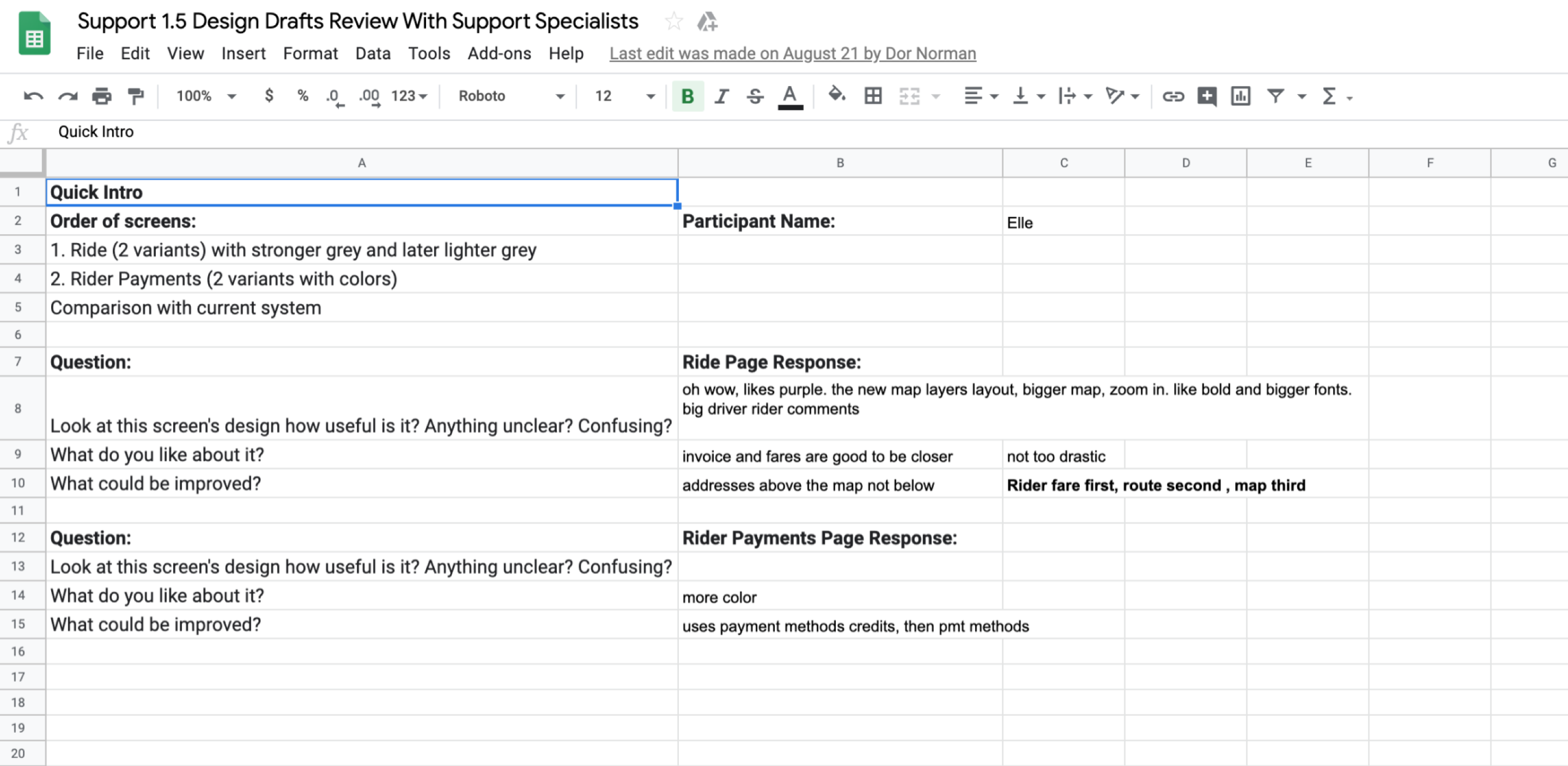
Screen-by-screen usability test review, done together with support specialists
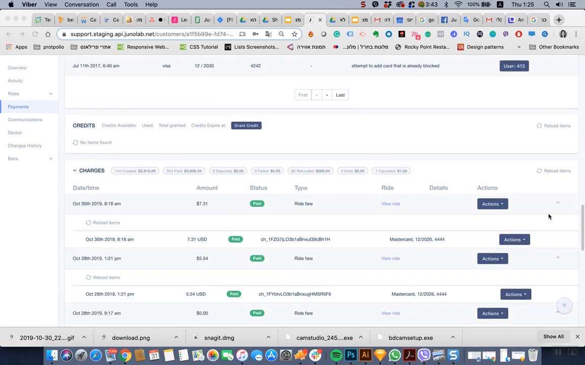
Walkthrough of the original support console — rides, payments and charges
The 1.5 design system: typography, menus, input states and components
- ✓Quick adaptation to a large project
- ✓Low costs — testing on users before development
- ✓Satisfaction among internal workers
- ✓The joint success of design and product development teams